
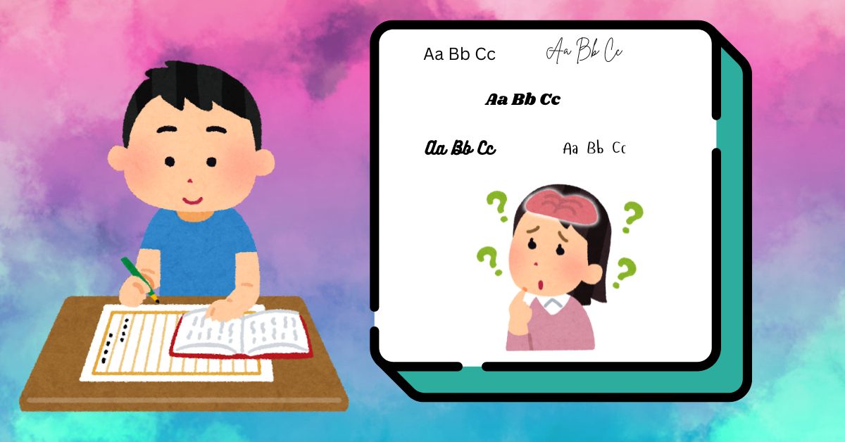
Using too many different fonts could indeed be confusing for students learning correct handwriting, especially when they’re still developing letter recognition and formation skills. However, there are ways to balance engaging classroom posters with handwriting consistency:
1. Use fonts that align with handwriting standards
If you’re teaching print or cursive, using recommended fonts modelled after your curriculum’s handwriting style can reinforce correct letter formation. This ensures that classroom visuals support what students are practicing.
2. Keep consistency in key learning areas
For posters that directly teach handwriting, letter formation, or spelling, it’s best to use the same standardized font throughout. However, for posters with inspirational quotes or thematic decorations, you can still experiment with creative fonts without confusing students, if they do not deviate too much from what is being used in the classroom.
3. Introduce font variations as a learning opportunity
Since students will encounter different fonts in books, signs, and digital texts, it’s helpful for them to see variations and learn to adapt. You could even create an activity where they compare fonts to their handwriting style to reinforce recognition.
4. Prioritize clear, readable typography
Even when using different fonts for engagement, clarity should always come first. Avoid overly stylized or hard-to-read fonts and ensure students can easily recognize letter shapes.
5. Avoid the overuse of capital letters
Students are taught that capital letters are used in certain instances, such as at the beginning of a sentence or for proper nouns, so try to avoid using them too often. It is also a good idea to clarify why a heading might be written in all capital letters.